
A modern, mobile-first experience for Zaxby’s diners
In 2016, I designed the user experience for a southern restaurant chain called Zaxby's. I led UX design and collaborated with an outside agency on visual design." I worked with stakeholders to clarify business goals and align the experience with broader brand objectives.
* The Zaxby’s website has been redesigned and engineered since we designed and launched our version in 2016.
A modern, mobile-first experience for Zaxby’s diners
Cubby is a self-storage management platform that's modernizing a $50B industry. I led the 0→1 design of Cubby’s Revenue Suite with a cross-functional team of engineers and product managers.

The problem
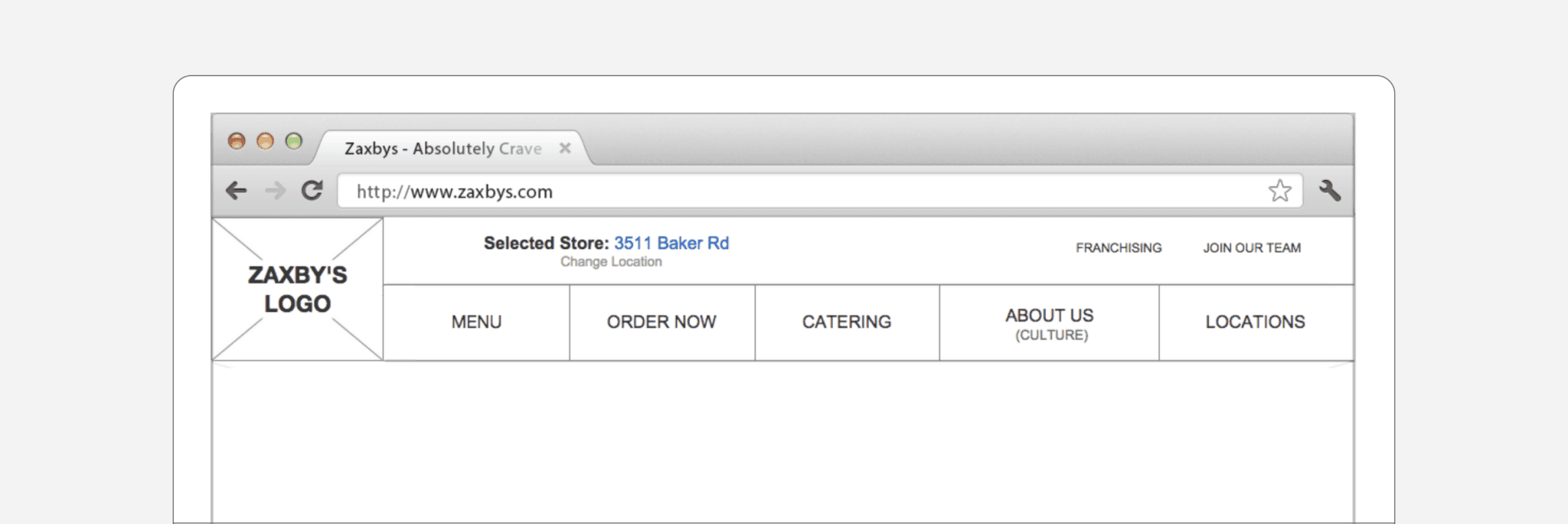
The older site had an underdeveloped brand identity, poor information architecture, an overly elaborate menu, and put everything above the fold. Most glaringly, the site was not optimized for mobile devices. These problems made growing into new markets difficult.
The main navigation included a link to every page on the site, organized into massive drawers with poorly fitting categories to anchor the information. There was no prioritization. For example, 'Order Now' and 'Coupons' received equal treatment despite vastly different business value.
The problem
The older site had an underdeveloped brand identity, poor information architecture, an overly elaborate menu, and put everything above the fold. Most glaringly, the site was not optimized for mobile devices. These problems made growing into new markets difficult.
The main navigation included a link to every page on the site, organized into massive drawers with poorly fitting categories to anchor the information. There was no prioritization. For example, 'Order Now' and 'Coupons' received equal treatment despite vastly different business value.

Goals
The primary business goal was to update the company website to better align with modern responsive web trends, optimize for ordering experiences like delivery and on-the-go pickup, and promote new franchising and catering opportunities.
Goals
The primary business goal was to update the company website to better align with modern responsive web trends, optimize for ordering experiences like delivery and on-the-go pickup, and promote new franchising and catering opportunities.
Goals
The primary business goal was to update the company website to better align with modern responsive web trends, optimize for ordering experiences like delivery and on-the-go pickup, and promote new franchising and catering opportunities.
Research
After talking to users and reviewing click data, we found that drop-offs were high and ordering was low. We traced this to a misguided information architecture that forced users to work too hard to find what they needed. On top of that, cramming everything above the fold was a legacy desktop strategy that didn't translate to mobile, where screen space is limited and scrolling is natural.
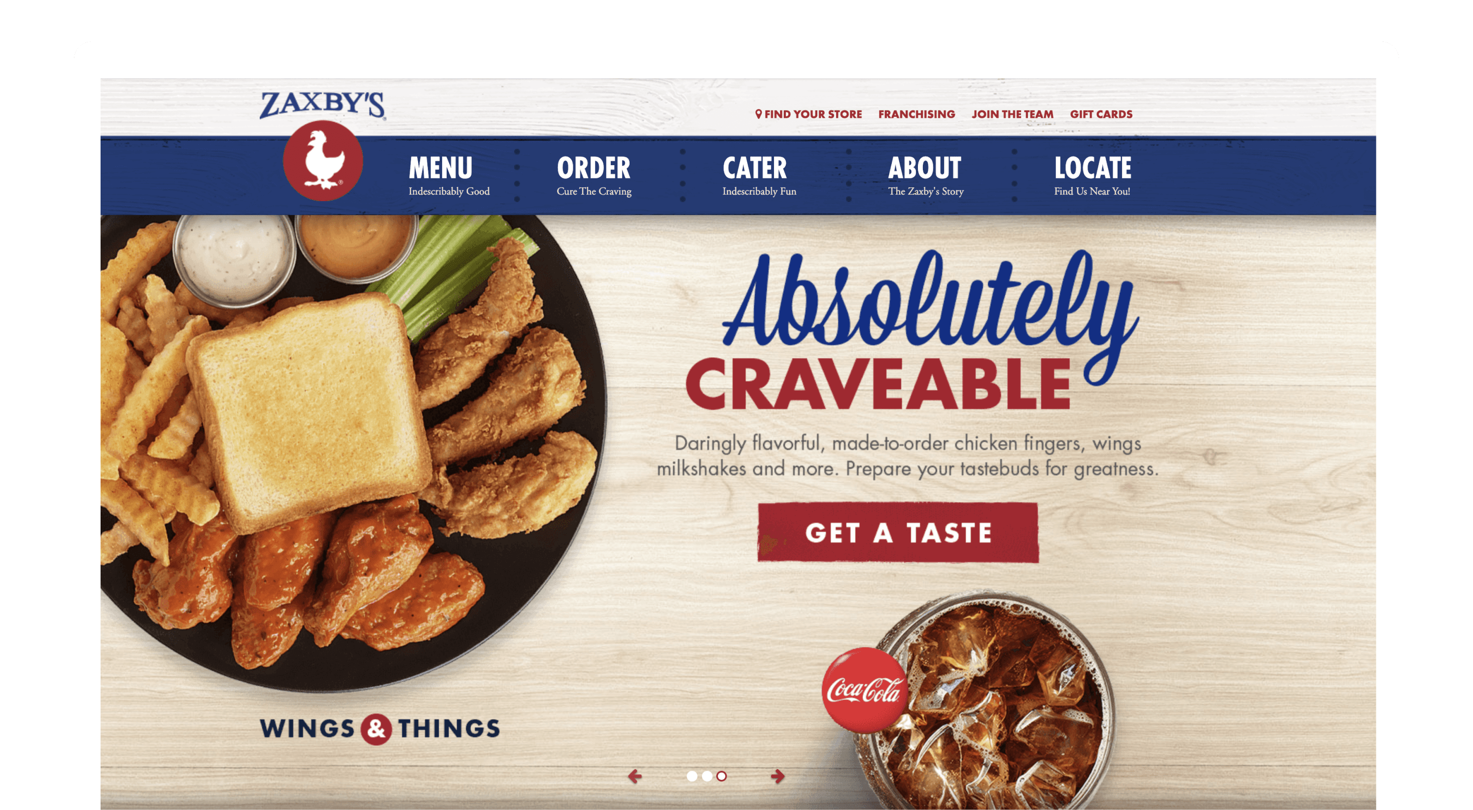
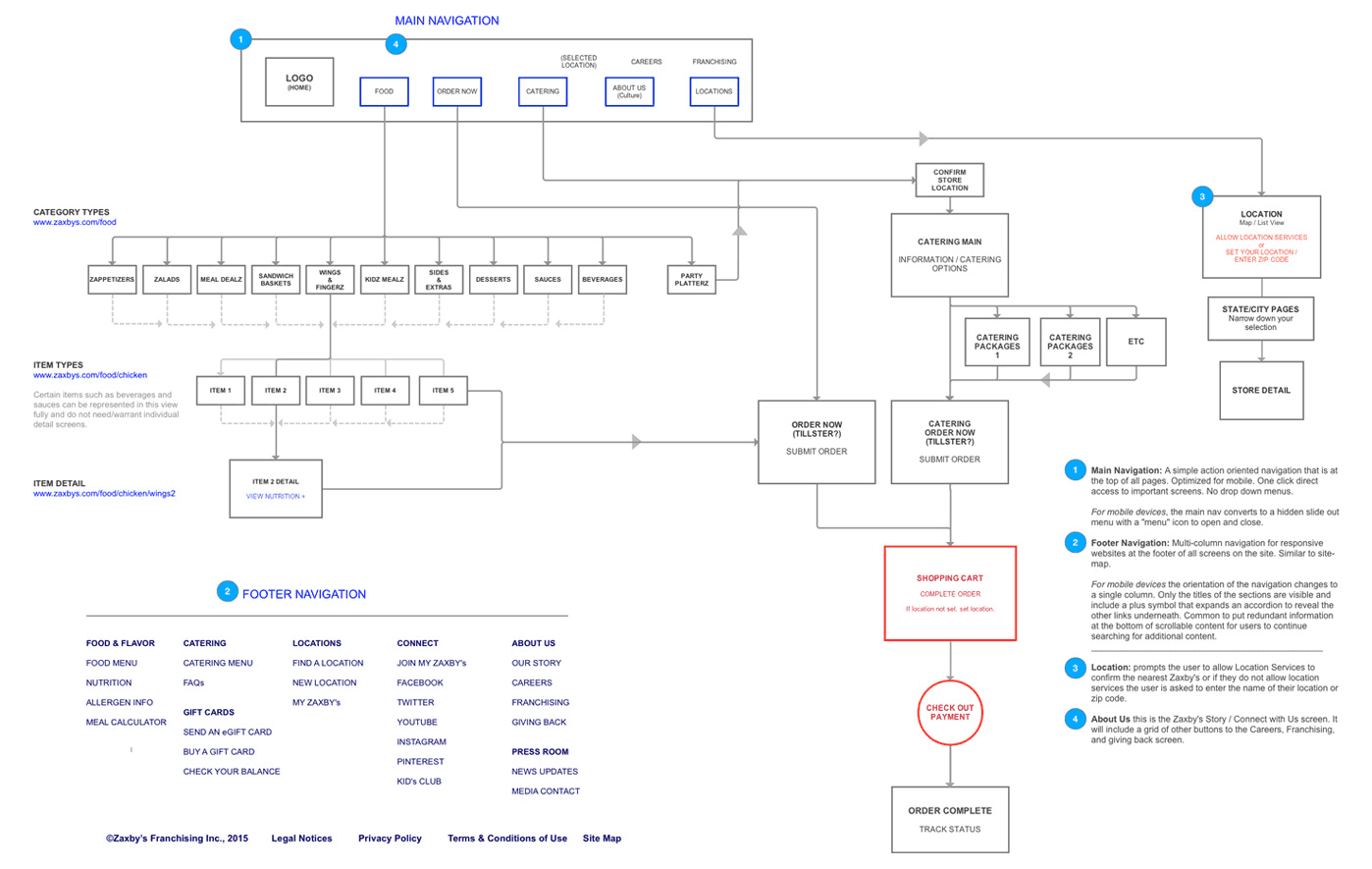
The design
To fix these problems, we removed all non-essential links from the navigation and moved them to the footer. We focused the navigation on core journeys: Menu, Order, Cater, About, and Locate. We then changed the page designs to extend down past the page fold. We used this extra space to cross-promote pages of secondary importance (the ones removed from the header). We used imagery and iconography for the buttons to promote those links better. For example, while on the About page, a person may also be interested in Franchising and opportunities to Join the team.
The impact
Traffic increased across the site, drop-off rates fell, and both franchise inquiries and catering bookings grew. We launched the new site in 2015. The relaunch contributed to increased press attention and franchise growth. Forbes magazine added it to the Best Food Franchises list a year later in 2016.
▲
35% more traffic growth
after site redesign
▼
40% less drop-offs on mobile
from improved navigation & responsive design
🏆
Featured in Forbes best list
Best Food Franchises (2016)
